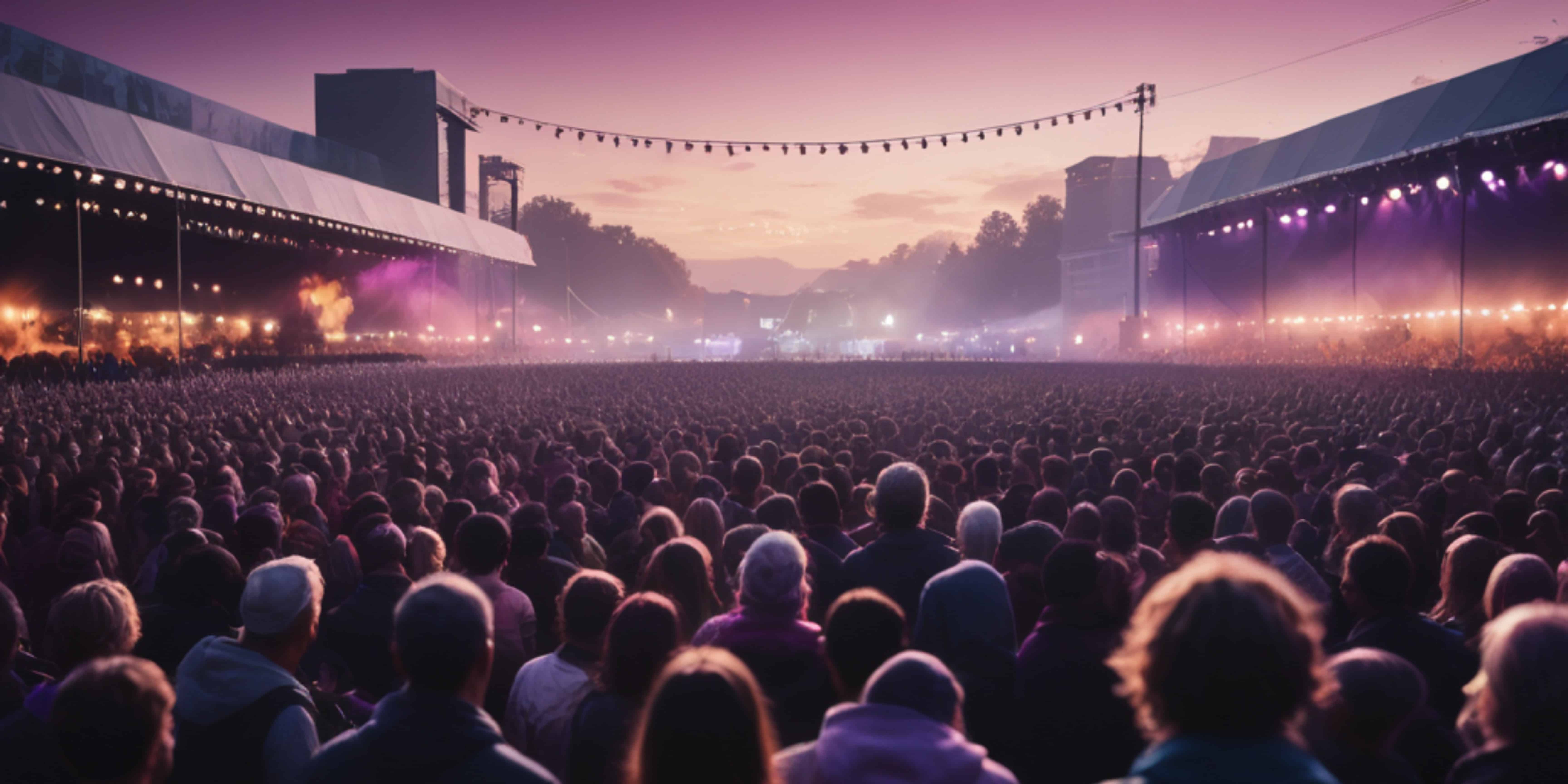
Planning music events and festivals takes considerable time and attention. From drawing up a marketing plan to managing on-site logistics, it’s a massive group effort to pull off a successful show. At the core of all that planning is your event page – the digital front door and ticket booth for your event. This page is where your target audience finds the most important details and, ultimately, the way to purchase tickets. A festival’s website serves as the primary hub where design for mobile speed and clarity converts visitors. In 2026’s fast-paced live events scene, fans have more options and higher expectations, so making a strong first impression online is critical.
A good, well-crafted music event page draws in potential ticket buyers by delivering the experience you’re promising and making it simple to buy. Think of it as the final conversion point: all your social media buzz and ads lead interested people here, and the page needs to seal the deal. According to industry research, users form opinions about a website almost instantly – in just 50 milliseconds (0.05 seconds) – as noted in studies on web design and conversion rates. Furthermore, 94% of those first impressions relate to design and layout, directly affecting credibility based on website aesthetics. In other words, your event page’s look and usability directly affect whether visitors stick around. If it’s confusing or unappealing, they’ll bounce to something else, and you’ve lost a ticket sale.
Experience has shown that spending time perfecting your music event page pays off. Many savvy event organizers treat their event page as a strategic asset, not an afterthought. A polished page filled with the right content can dramatically boost ticket conversions by making it effortless for fans to find info and click “Buy.” On the flip side, a disorganized or glitchy page can sink even the best marketing campaign – one veteran promoter we spoke with recounted how an unclear event page led to dozens of customer inquiries and drop-offs until they redesigned it mid-campaign. The lesson? It’s worth putting in the effort up front to get your event page right.
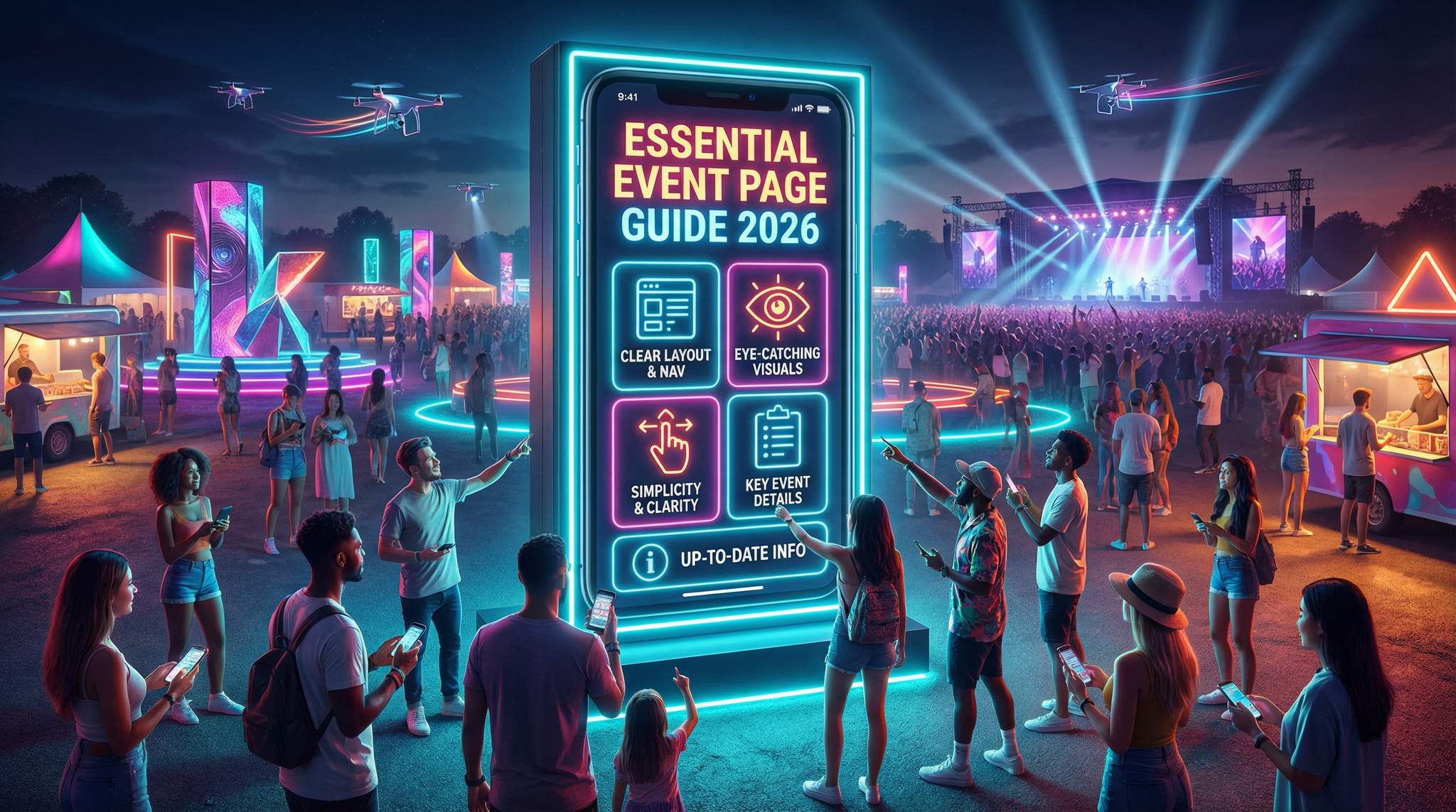
To set up a stunning music event page, there are a number of core elements you should focus on. Below, we’ll break down five essential steps (which also double as best practices) for creating an attractive and high-converting event page. From layout to visuals to keeping information current, these fundamentals will help you hook your targeted audience and turn curious visitors into excited ticket buyers.
Data-Driven Event Marketing
Track ticket sales, demographics, marketing ROI, and social reach in real time. Exportable reports give you the insights to make smarter decisions.
| Essential Event Page Element | Why It Matters |
|---|---|
| Clear Layout & Navigation | Avoids user frustration. Intuitive pages keep visitors engaged and reduce bounce rates (88% of consumers won’t return after a bad UX), according to insights on web design and conversion rates. Easy menus and clear structure help people find what they need without confusion. |
| Eye-Catching Visuals | Captures attention instantly. Nearly all first impressions are visual – 94% relate to site design quality, affecting credibility based on website design. Strong images and graphics also convey your event’s vibe at a glance and make the page memorable, as visual aids can improve info retention by up to 400%. |
| Simplicity & Clarity | Prevents overwhelming your audience. A clean, uncluttered page is easier to digest – studies show simplifying a homepage and improving UX boosted sign-ups by 9% in one test. Clarity in content (what, where, when) within the first screen (8 seconds or less) is crucial for keeping visitors engaged and keeps them from bailing. |
| Key Event Details | Provides critical information up front. Fans need date, time, venue, lineup, ticket options, etc., to make a decision. Presenting these clearly and creatively answers attendees’ main questions immediately, which is essential for high-converting event websites, building trust that your event is well-organized. |
| Up-to-Date Information | Builds trust and avoids confusion. An outdated page (old dates, missing updates) frustrates users and hurts your credibility, a common mistake in festival marketing and promotion. Continually updating new info (announcements, changes, sold-out notices) shows professionalism and keeps fans informed, which encourages ticket purchases. |
Now, let’s dive into each of these essentials in detail:
1. Think About Your Layout and Maneuverability
The first thing to plan is the layout and maneuverability of your music event page. This is the page’s foundation – if navigating it feels like a maze, visitors won’t stick around. Most of us will quickly exit a site that is confusing or difficult to use. In fact, 75% of users admit they judge a company’s credibility based on its website design, confirming that confusing design undermines trust immediately. A clear layout isn’t just about looks, it’s about trust. Modern festival producers know a well-structured site can make the difference between a curious visitor and a ticket buyer.
Ready to Sell Tickets?
Create professional event pages with built-in payment processing, marketing tools, and real-time analytics.
When building your event page, put yourself in your audience’s shoes. Ask questions like:
- Is the page easy to read and navigate on both desktop and mobile?
- Does the layout make logical sense for finding info?
- Is there too much clutter, or is everything essential visible at a glance?
Ensure that the most important details – event name, date and time, location, and a big “Buy Tickets” button – are immediately visible above the fold (without scrolling). Key actions should be obvious. Industry data backs this up: calls-to-action placed prominently at the top get 304% more clicks than those buried below the fold, meaning you should never have lower CTAs. In practice, this means your “Get Tickets” or “RSVP” button should be one of the first things a visitor sees. Use a clean navigation menu or simple anchor links if your page is long, so people can jump to sections like Lineup, Schedule, or FAQ easily.
Pro Tip: Always preview your event page on a smartphone and tablet before publishing. As of 2026, roughly 60% of all web traffic comes from mobile devices, which indicates a massive mobile traffic share. If your page isn’t mobile-friendly (e.g., text requires pinching to read or buttons are too small), you risk losing a huge chunk of your audience – 73% of users will abandon a site that isn’t mobile-optimized, which negatively impacts SEO and conversions. Design mobile-first, then scale up for desktop.
Also pay attention to page speed and smooth loading. A beautiful page means nothing if it doesn’t load or respond quickly – online visitors are impatient. Google’s research shows over 50% of mobile visitors leave if a page takes more than 3 seconds to load, because users today simply expect sites to be fast. Furthermore, mobile visitors are especially impatient, and every extra second of delay (up to ~5 seconds) can cut your conversion rates by about 4.4% for each second of load time. To avoid this, use optimized images (compressed file sizes), avoid heavy plug-ins or autoplay videos that slow things down, and consider using a simple embedded map (rather than a huge high-resolution image) for directions. A snappy, responsive page keeps potential ticket-buyers from bouncing out of frustration.
Free Tool: Split Tickets for Max Gross
Given capacity and a target price, the optimizer proposes Early Bird / GA / VIP allocations and prices — with projected gross at 100%, 80% and 60% sell-through.
Finally, test the maneuverability of your page with a fresh set of eyes. Before going live, have someone unfamiliar with your event try to find key info on the page quickly. This kind of usability testing can catch confusing elements (like a misplaced link or unclear section title) that you might overlook. Remember, if any crucial detail or ticket link is hard to find, that’s a sale you might be losing.
In short, your event page’s layout should be intuitive, user-centric, and fast. Make it so that even a first-time visitor can immediately grasp what your event is and how to attend. As one of our Ticket Fairy guides notes, treating your event website as a welcoming storefront means more people will walk in and complete the checkout process. Additionally, ensuring a responsive design prevents friction for websites ranking on Google.
Grow Your Events
Leverage referral marketing, social sharing incentives, and audience insights to sell more tickets.
2. Make Your Event Page Pop with Color and Visuals
As mentioned, the way your music event page looks is incredibly important – aesthetics and visual appeal can make the difference between catching a visitor’s interest or losing them. Humans are highly visual creatures: the brain processes images 60,000 times faster than text, according to charts and statistics on visual processing, and colorful, compelling visuals can instantly convey the energy and vibe of your event. Your goal should be to create an eye-catching page that reflects your event’s personality and gets fans excited.
Start with a strong hero image or banner at the top of the page. This could be a live photo of a past show, a promotional flyer, or a photo of your headlining artist in action. High-quality images of crowds enjoying themselves or artists performing can spark emotion and FOMO (fear of missing out) in your audience. For example, if you’re hosting a music festival, a wide shot of last year’s packed crowd at sunset or a vibrant promo poster immediately tells a story. Many top festivals – from Tomorrowland to local indie fests – use striking visuals on their pages to transport visitors into the atmosphere of the event. If you have a short teaser video (30 seconds or so) showcasing highlights, consider embedding it at the top or as a background banner (just ensure it doesn’t slow down the site too much). Movement can be engaging, and an autoplay video with no sound can give a dynamic feel.
Beyond the hero section, use visuals throughout the page strategically. Create a carousel of event flyers or past event photos to show history and credibility. Include artist images next to their names in the lineup section so fans recognize them instantly. If your event involves art installations or features like rides, displaying those visuals can be a big draw too. Just be sure every image serves a purpose – don’t add random stock photos that don’t relate to your event, as they can confuse or distract visitors. This is about showcasing your event’s unique appeal.
Color choice is another big factor. Stick to a coherent color scheme that matches your event branding (and the tone of the music or theme). For instance, an EDM rave might use neon colors and bold fonts, whereas a jazz night might opt for a classy dark theme with gold accents. The key is contrast and readability: make sure text stands out against background colors. Important info (like date and ticket price) could be highlighted with a pop of color or a stylized icon.
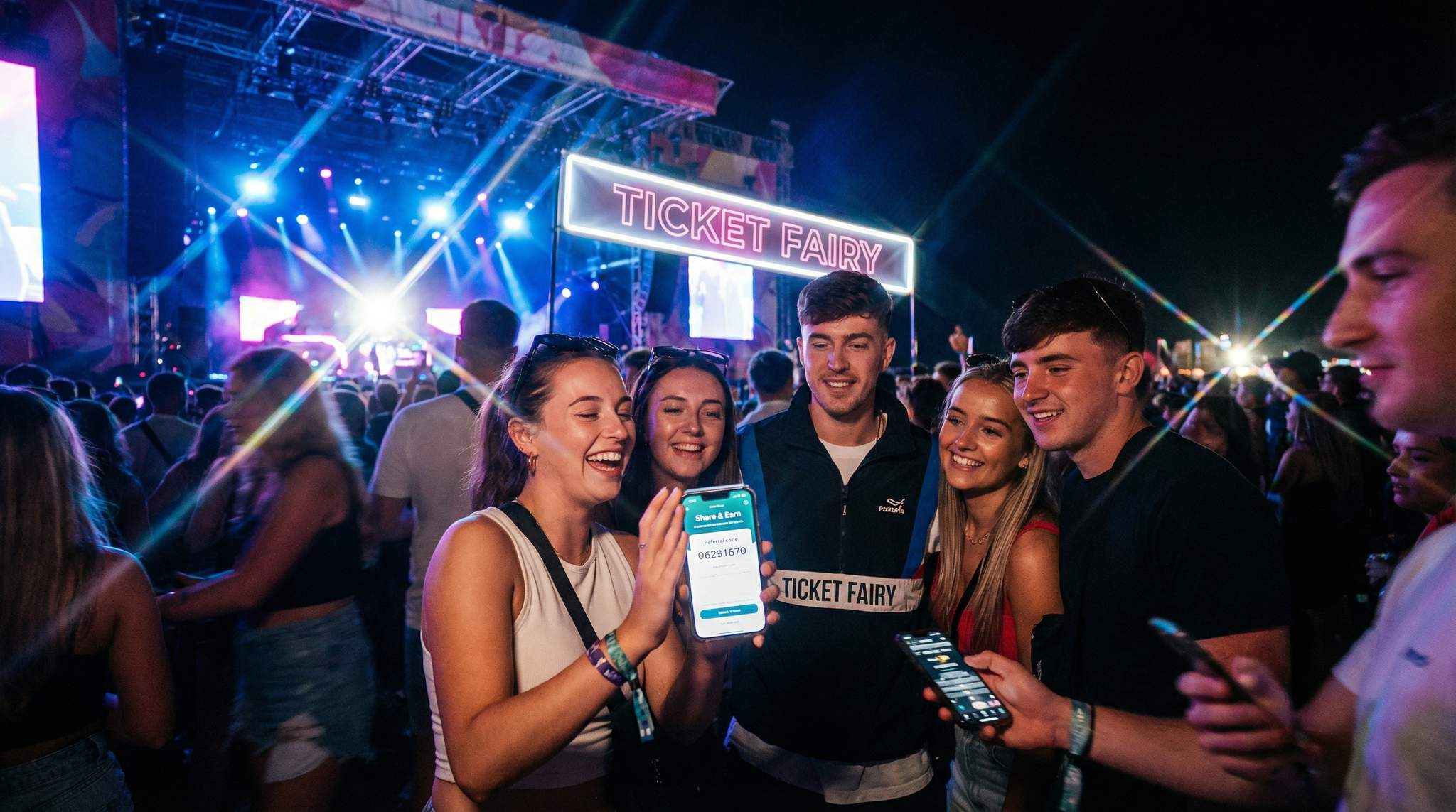
Turn Fans Into Your Marketing Team
Ticket Fairy's built-in referral rewards system incentivizes attendees to share your event, delivering 15-25% sales boosts and 30x ROI vs paid ads.
Importantly, visuals should enhance clarity, not hinder it. Avoid putting text on overly busy backgrounds where it’s hard to read. Each image or graphic should be high resolution but optimized for web, so it looks crisp without slowing the page. And don’t forget accessibility: include alt text for images (e.g., <img alt="Band X performing to a crowd of 500 at night">) so that visually impaired users or anyone using screen readers can still get context. This also helps your SEO a bit.
These visual elements not only make your page prettier – they actually help drive engagement and ticket sales. One marketing study found that people remember only 10–20% of information three days after hearing it, but if you pair info with a relevant image, retention can jump by 400%, as highlighted in statistics on visual retention. In practice, that means a visitor is far more likely to recall your event date or headliner if they saw it in a striking poster image versus plain text. Visuals also lend credibility: a page with professional-looking graphics signals that your event is high-quality, whereas a dull or empty page might make folks doubt if the event is even legit.
For inspiration on content, consider the types of content that resonate with ticket buyers. Our piece on 10 essential types of online content to attract ticket buyers to your music festival highlights ideas like artist interviews, behind-the-scenes clips, and fan testimonials – some of which you can incorporate or link to from your event page to make it more compelling. Ultimately, make it beautiful: from suitable color choices to vivid photos and maybe a short promo video, a beautiful event page will catch your audience’s eye and keep them on the page long enough to convert them into ticket buyers.
3. Keep Your Page Simple and Clear
When it comes to event pages, simplicity is king. A common mistake is trying to cram every bit of information, graphic, or widget onto the page. In reality, a cluttered page can overwhelm prospective event-goers and drive them away. Practice minimalism with your event page design and content layout. It should be concise yet impactful – delivering the key points clearly without excess noise.
Start by organizing your content with a logical hierarchy and plenty of white space (empty space between elements). Ensure that text sections (event description, venue details, etc.) are broken into short paragraphs or bullet points rather than one massive block of text. Use headings or icons to label sections (for example, ? for schedule, ? for venue location) so that at a glance, people can identify each part of the page. A balanced layout is visually calming: try to keep roughly equal margin or padding around elements and align sections neatly. If your page looks like a chaotic flyer with info boxes floating everywhere, take a step back and simplify the design.
It’s also important to limit the number of menu items or links if your event page is a standalone microsite. Too many options can confuse users. If you have a multi-section event page (say one-page scrolling style), a top menu with anchors like About – Lineup – Tickets – FAQ – Contact is usually sufficient. Make those menu labels clear and intuitive. Case in point: one festival website found that renaming vague menu labels and reorganizing content increased user engagement noticeably, supporting findings on simplifying a homepage and improving UX. When users instantly understand where to click for “Lineup” or “Schedule,” they’re more likely to explore further instead of bouncing.
Smart Promo Codes & Presale Access
Create percentage or flat-rate discount codes with usage limits, date ranges, and ticket type restrictions. Plus unlock codes for private presales.
Another aspect of simplicity is load time and technical simplicity. As discussed earlier, heavy pages with too many scripts or enormous images will load slowly, especially on mobile or weaker connections. Keeping the page design simple (fewer embedded videos, limited use of custom fonts or animations) not only makes it look cleaner but ensures it performs better. There’s a famous UX statistic that every $1 invested in user experience can yield a $100 return, because poor UX drives users away – while that covers a broad range, it underlines that a user-friendly page (simple navigation, no broken links, quick to find info) directly impacts your bottom line through higher conversions.
Clarity goes hand-in-hand with simplicity. Be very clear and direct with the text on your page. Use plain language and avoid overloading people with superfluous details in the main sections. For example, instead of a 3-paragraph history of how your event came to be, maybe just one engaging sentence about the event’s vibe (“Join us for a night of soulful jazz and gourmet dining under the stars”) and then bullet the essentials (Date, Time, Venue, Tickets). You can always link to a blog post or an “About Us” page for those who want more backstory. The immediate priority is that a visitor scanning your page in a few seconds picks up the what, when, where, and why they should attend.
Keep visuals and text balanced. If you have a busy background image, keep the text minimal on top of it. If you’ve written a detailed FAQ or schedule, perhaps collapse it into an accordion-style section so the page doesn’t appear too dense at first glance (the user can click to expand details they care about). Many effective event pages use a lightbox or popup for things like detailed terms and conditions – the main page stays clean, and extra info is available on demand.
Warning: Don’t overcrowd your event page with every flyer, sponsor logo, or social feed all at once. Too much clutter can overwhelm and confuse your audience. If a visitor feels bombarded by flashing graphics or an unending scroll of text, they’re likely to give up. Remember, 88% of online consumers are less likely to return if they have a bad user experience on a site, as noted in studies on bad design and UX. Make conscious cuts to anything that isn’t serving a clear purpose on the page. Simplicity not only looks professional; it guides the viewer’s attention to what really matters – the info that convinces them to click that ticket button.
Sticking to a simple and clear approach will make your music event page look neat, professional, and user-friendly. It sends a message that you as an event organizer know what you’re doing, which in turn increases trust. A potential attendee should never feel “lost” or overwhelmed on your page. If you adhere to this principle, you’ll keep them focused on getting excited about the event and proceeding to purchase, rather than wandering off due to confusion.
4. Upload Only the Most Relevant Information
Next, be very deliberate about the information you include on your event page. This point echoes the importance of simplicity, but it’s about content selection: you want only the most relevant details pertaining to your event on this page. Think of it this way – what does someone absolutely need to know in order to decide to attend and to actually attend without issues? Those are the core details to feature prominently. Everything else is secondary and can be linked elsewhere.
Free Tool: When Should You Announce?
Pick your event date and genre — the free planner outputs a recommended announce, presale, on-sale and reminder schedule anchored to how your audience actually buys.
At a minimum, your event page must include the critical facts:
- What – The name of the event and a brief description or tagline (e.g., “An all-night techno party featuring legendary DJ XYZ”).
- When – The date and start/end times. Include the day of week if it adds clarity (Friday vs. Saturday can matter for people’s schedules). If it’s a multi-day festival, list all dates or the range, and perhaps daily start times.
- Where – The venue name and address (with city, state/country). If the venue is less known or an outdoor location, consider adding a clickable Google Maps link or an embedded map for easy directions.
- Who – The key performers, artists, or speakers. Festival lineups can be listed, or for a single concert, highlight the headliner and any support acts. If the “who” is a big selling point (e.g., a famous artist), make sure it’s very obvious – like the artist’s name in large font or their photo, as discussed in visuals.
- How – How to get tickets or register. This includes ticket types and prices (e.g., General Admission, VIP, Early Bird pricing deadlines). Often a short blurb like “Tickets starting at $40 – Early bird available until June 1” works, along with a prominent Buy Tickets link or button that leads to the checkout process.
You should also consider other relevant info that attendees care about: age restrictions (is it 18+ or family-friendly?), any notable amenities or features (e.g., “Free parking available”, “Food trucks on site”), and perhaps a short FAQ if there are common questions (like re-entry policy, what to bring, etc.). However, be cautious about throwing too much text on the main page. One technique is to provide a one-liner for each and link to more details. For instance, “Food & Drink: Available from local vendors (see FAQ for full list of vendors)” – that way truly interested folks can click an FAQ link, but casual visitors aren’t forced to read a list of 20 food stalls on the spot.
The information must be presented in an interesting and creative way when possible. This is where design meets content: use icons or small graphics to represent info (a calendar icon next to the date, a clock next to show times, a map pin for the venue). This makes the details easy to scan and visually appealing. You might format the key info as a bullet list or a neat info box. For example:
? Saturday, March 14, 2026, 6:00 PM – Midnight
? The Electric Ballroom – Los Angeles, CA
?? Tickets: $40 GA / $80 VIP (Early-bird until Feb 14)
Recover Lost Ticket Sales
Automated abandoned cart emails re-engage potential buyers at the optimal time, recovering lost sales and boosting your conversion rate.
This kind of format is concise, scannable, and covers the basics. It’s far more effective than burying these facts in a paragraph of descriptive text. Plus, it looks professional and well-organized.
Also, don’t forget to strategically place contact information or support links. A small “Contact us for questions” with an email or a link to a contact form can be placed at the bottom or in the FAQ. Knowing they can reach out easily gives visitors additional confidence if they have a specific concern not answered on the page (e.g., questions about accessibility accommodations or refunds).
By curating the info on your event page to just what’s relevant, you prevent information overload while ensuring fans have everything they need to make a decision. Data supports this approach: web visitors today decide whether to stay on a page within about 8 seconds, making speed crucial for keeping visitors engaged, which means in that brief time they should be able to pick up the who/what/when/where of your event. If those details are clear and enticing, they’ll keep reading. If not, they might wander off.
One more tip: make sure any ticket purchase link or embedded ticket widget is clearly connected to the event details. Nothing is worse from a user standpoint than clicking “Buy Tickets” and being unsure if it’s for the right date or package. If you use Ticket Fairy’s platform to embed the ticket widget, for example, it’s usually straightforward. If you link out to an external ticketing page, ensure it opens in a new tab and perhaps mention on the button where it leads (e.g., “Buy on Eventbrite” – although if you’re using Ticket Fairy you’d have an integrated page). The key is to keep the journey smooth from info to checkout.
In summary, focus your event page content on the essentials: the need-to-know details that persuade someone to attend and help them plan for it. Present those details in a clear, attractive way. By doing this, you create a formula that is impactful and will increase the chances of your targeted audience clicking that purchase button with confidence.
5. Always Update Your Page with New Information
Lastly – and this is an ongoing commitment – make sure you consistently update your music event page with any new or changing information. An event page isn’t a “set it and forget it” part of your marketing; it should be a living resource that reflects the latest status of your event. Nothing will erode trust faster than outdated or incorrect info on the page. It not only confuses potential attendees but can also spark frustration and reputational damage.
Think of what happens if someone visits your page and sees a past date or “Lineup coming soon” when you actually announced the lineup on social media last week. They’ll be unsure if the event is still on, or they might miss critical updates and show up at the wrong time or place. In fact, failing to update your official website or event page is noted as a common mistake regarding marketing promotion and how to get it right. Fans expect the official page to be the source of truth. If it lags behind, they could question your event’s professionalism or even the legitimacy of the event. Furthermore, an outdated site that isn’t responsive can hurt rankings on Google.
So what kind of updates might you need to make? Here are a few examples:
- Date or venue changes: If your event date shifts or you change venues, update the page immediately (and highlight the change with a note like “Update: Venue changed to XYZ due to high demand”). Fans will appreciate the transparency, and it will save you countless emails from confused ticket holders.
- Lineup additions or changes: Added a supporting act or had an artist cancel? Update the lineup section and perhaps use a highlight or asterisk to denote the new act, e.g., “Just Added: DJ ABC”. If an artist drops out, remove them and consider addressing it (even a brief “Artist X is no longer able to perform – but we’ve added Y as a special guest” maintains trust rather than silently omitting and causing questions).
- Ticket tier status: If early-bird tickets sold out or a particular tier is no longer available, mark it or gray it out. Some event pages strike through a sold-out tier or display a subtle “Sold Out” label next to it. You can also update with urgency messaging like “80% sold out” if your system supports it – that can actually spur late buyers. Just always be truthful; false scarcity is a trust-breaker.
- Important announcements: Use your event page as the hub for key announcements like gate times, health & safety protocols, weather alerts (for outdoor events), or special instructions (e.g., “parking is limited, ride-share recommended”). A common approach is to have a clearly labeled “Latest Updates” section or a banner on the page for any critical news. For example, if new government guidelines in 2025 required proof of vaccination or a negative test, an event page should have reflected that prominently at the time.
- Post-event info: If your event is recurring or you want to leverage the traffic even after the event, update the page after it’s over with something like “Thank you for attending! See photos from the event here [link]and stay tuned for our next event.” This way, even if someone stumbles on the page after the fact, they get a positive, up-to-date impression (and maybe a call-to-action to follow your socials or join a mailing list for the next one). It shows that you care about the community and keeps them engaged for the future.
Staying on top of these updates requires coordination. It’s wise to maintain a simple checklist of all places that need updating when something changes – the event page, ticketing platform, social media, email blasts, etc. – to ensure consistency across marketing channels. This ensures nothing falls through the cracks. The effort is worth it because consistency across channels builds trust. If your Instagram announces a new headliner but your website doesn’t list it, you create confusion. Avoid that by treating your event page as the central reference and syncing all announcements with it as quickly as possible.
Warning: Never leave your event page unattended with stale or incorrect info. An empty or outdated page can do serious damage. Fans might assume tickets are no longer available or that the event is canceled. We’ve seen cases where an organizer forgot to update an old date on the page and fans showed up on the wrong day – a nightmare scenario that’s entirely preventable. Don’t let a lapse in updates undermine all your hard work in planning the event.
Regularly refreshing your content isn’t just for attendees’ clarity – it’s also good for SEO and discoverability. Search engines favor pages that have fresh, relevant content, especially for event searches. “Google loves up-to-date content” is a common adage in SEO, and it helps first-time visitors instantly trust the site. A page that’s been recently updated with the latest details is more likely to rank when people search for your event or related keywords. Plus, it sends a message to media or potential partners checking out your event that you are organized and on top of things.
In practice, updating your event page might be as simple as logging into your ticketing platform’s dashboard and editing the event info, or updating your website’s CMS (content management system) if you host it separately. With Ticket Fairy, for example, you can log in anytime and update details, add new ticket tiers, change the event cover image, etc., and the changes go live immediately to your event listing. Make it a habit: whenever something about the event changes or if a new common question emerges (“Is there an age limit?”), update the page that day.
Bringing It All Together
Creating a stunning music event page is both an art and a science. By focusing on the five essentials above – intuitive layout, vibrant visuals, simplicity, relevant content, and timely updates – you set the stage for an excellent user experience that can significantly boost your ticket sales. It’s often one of the last steps in converting an interested person into a paying attendee, so it deserves as much thought as your ad campaigns or lineup curation. Remember that your event page is usually the first or second touchpoint in the attendee journey (they might find out about your event via an ad or social post, then click through to the page). If that touchpoint is smooth, informative, and exciting, it creates momentum toward a purchase. If it’s confusing or dull, it can stop a potential sale in its tracks.
To recap some key takeaways: ensure your page looks professional and loads fast, because first impressions count a ton when forming opinions about your brand, engage visitors with great visuals and a clear call-to-action, don’t drown them in extraneous info or clutter, provide all the must-know details in a polished format, and keep everything current through to event day. These steps build trust with your audience – they feel confident buying a ticket because your page signals that you, the event organizer, pay attention to detail and care about their experience.
Finally, make sure you’re maximizing the reach of that awesome event page. Promote it on all your channels: your social media bios and posts should link directly to the event page, your email newsletters should have clear buttons leading to it, and any online ads (Facebook, Instagram, Google, etc.) should land people on this page (or a tailored landing page for the campaign). In our guide to mastering your ticket on-sale launch, we emphasize coordinating every marketing channel to drive a record-breaking on-sale, creating a selling spectacle – your event page is the hub where all that traffic converts, so it needs to shine. Track the page’s performance too: use Google Analytics or your ticketing platform’s stats to see how many people visit, where they come from, and if they drop off at any point. This data can offer insights to help you reiterate value (e.g., if many people view the page but don’t click “Buy,” maybe the page needs a clearer value proposition or you might need to simplify the checkout steps).
With a platform like Ticket Fairy, setting up a stellar event page is straightforward. You can build an event ticketing page yourself – customizing the backdrop, adding your logo, formatting text, embedding videos in the description, and setting up ticket tiers – in under 10 minutes if you have all your content handy. The system is designed to incorporate the best practices we’ve discussed: mobile-responsive layouts, fast loading, and easy attendee checkout. Many organizers have leveraged these tools to launch events that sell out quickly, all because the information was clear and the buying process was seamless. You can create your event page right now by simply visiting the Ticket Fairy website and selecting the option to create an event in the menu. With the right approach and tools, your event page can be more than just a notice – it becomes a vibrant invitation that converts browsers into ticket buyers, setting your event up for success.
Beyond just building a beautiful layout, many promoters ask how to optimize events with Ticket Fairy to maximize their return on investment. Optimizing your event page goes hand-in-hand with leveraging backend analytics and marketing tools. By utilizing Ticket Fairy’s built-in demographic tracking, automated referral programs, and targeted ad integrations, organizers can continuously refine their strategy. Whether you are running a local club night or an international festival, these optimization features ensure your event page isn’t just a static flyer, but a dynamic engine that actively drives higher conversion rates and rewards your most loyal fans.
Frequently Asked Questions
Why is the design of a music event page critical for sales?
Users form opinions about a website in just 0.05 seconds, with 94% of first impressions relating directly to design and layout. A visually appealing and usable page builds immediate credibility. If a page is confusing or unappealing, potential ticket buyers will likely leave, resulting in lost sales and lower conversion rates.
How can I optimize my event page for mobile users?
Adopt a mobile-first design strategy, as approximately 60% of web traffic comes from mobile devices. Ensure the page loads in under 3 seconds to prevent abandonment and place the “Buy Tickets” button above the fold. Verify that text is readable without zooming and navigation is intuitive on smaller screens.
What are the essential elements of a high-converting event page?
A high-converting page requires a clear layout with intuitive navigation, eye-catching visuals like hero images, and simplicity to avoid clutter. It must prominently display key details—date, time, venue, lineup, and ticket options—immediately. Keeping information up-to-date and ensuring fast load times are also fundamental for retaining visitors and driving sales.
How do visuals impact the effectiveness of an event website?
High-quality images and videos process 60,000 times faster than text in the brain, instantly conveying the event’s energy. Visual aids can improve information retention by up to 400%, helping visitors remember key details. A strong hero image or video banner captures attention immediately, while consistent branding enhances professional credibility.
What information should be prioritized on an event landing page?
Prioritize the “What” (event name), “When” (date and time), “Where” (venue location), “Who” (lineup), and “How” (ticket purchase link). These critical facts should be visible at a glance, ideally above the fold. Concise presentation using icons or bullet points helps attendees quickly grasp the necessary details to decide to attend.
Why is it necessary to frequently update an event page?
Frequent updates ensure the page remains the reliable source of truth for fans, preventing confusion over venue changes, lineup additions, or sold-out tickets. Displaying outdated info damages trust and professionalism. Furthermore, search engines favor fresh content, so regular updates can improve the page’s visibility and search rankings.
How can organizers optimize events with Ticket Fairy?
Promoters can optimize events with Ticket Fairy by utilizing its comprehensive suite of marketing and analytics tools. This includes setting up automated ticket rep programs to incentivize word-of-mouth sales, integrating tracking pixels for retargeting campaigns, and analyzing real-time buyer demographics. By turning a standard event page into a data-driven hub, organizers can fine-tune their promotional efforts and significantly boost ticket conversions.