The Visual Challenge in 2026: Why Scroll-Stopping Creative Matters
Social Feeds Move at Lightning Speed
Modern event marketers face an unprecedented battle for attention. Social feeds are so crowded that you have mere seconds to captivate viewers before they scroll onward. Studies indicate the decision window on platforms like TikTok is as short as ~1.7 seconds, according to data on capturing attention in 2026. In fact, by the mid-2020s the average human attention span online has dwindled to 6–8 seconds, highlighting the need for instant engagement – meaning your ad’s visual hook must land instantly. If your creative doesn’t arrest the eye immediately with something compelling, most viewers will pass it by without a second thought. The first few moments (or first impression of a static ad) are make-or-break. This “scroll era” reality raises the stakes for event ad creative: only truly eye-catching visuals will earn that critical pause.
Visuals That Drive Action (and Ticket Sales)
Great visuals don’t just grab attention – they drive behavior. Humans are wired to respond to imagery and motion on an emotional level, as audiences crave engaging visual storytelling. It’s often said people remember ~80% of what they see versus only ~20% of what they read, based on visual content marketing statistics. While that exact ratio varies, the core truth stands: visual content is far more memorable and persuasive than text alone. For event marketers, that means the right poster design or social video can spark excitement (or FOMO) in ways a text blurb never could. Engaging visuals also tend to get shared more widely – one study found videos are shared 1,200% more than text and image posts combined, proving that video promotion outperforms static flyers. More shares = more organic reach. And reach translates to ticket sales when your creative is on-point. In fact, 87% of marketing professionals say video content directly increased their sales, helping fans feel the bass drop and purchase tickets, underscoring how powerful compelling visuals can be in moving fans from interest to purchase.
Quality Creative = Campaign Results
Experienced event marketers know that creative quality correlates directly with campaign performance. You can target the perfect audience and set a generous ad budget, but if the imagery or video is weak, the campaign will underperform, because you must stop the scroll to matter. On the flip side, scroll-stopping creative can elevate even modest campaigns into sell-out successes. Eye-tracking studies and A/B tests consistently show that changing up the visual element – the photo, colors, layout – often makes the biggest difference in click-through and conversion rates when testing creative elements like images versus carousels. For example, one festival’s test found that a short, dynamic video ad drove 5× higher CTR than a static image ad, demonstrating the power of comparing video against static assets. And a simple design tweak like using a high-contrast “Buy Tickets” button color boosted clicks by 12% in another campaign, proving that small tweaks drive data-driven wins. The lesson: investing time and effort into strong ad creative isn’t just aesthetics – it directly impacts your return on ad spend (ROAS). A vibrant, well-designed event promo can dramatically lower your cost per ticket sale, whereas a dull one wastes budget. In 2026’s competitive landscape, great creative is often the differentiator between events that struggle and those that sell out.
Designing Visuals That Pop: Key Principles for 2026
Bold Imagery with a Clear Focal Point
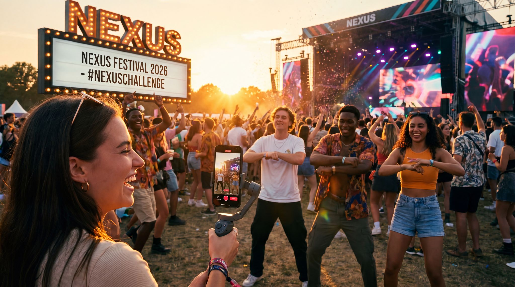
To stop fast-scrolling thumbs, bold imagery is essential. Choose visuals that instantly convey the energy and essence of your event. Popular approaches include an electrifying crowd shot or stage moment for a music festival, a striking close-up of a headlining artist for a concert, or an eye-catching graphic illustration that captures a conference theme. Whatever you choose, make sure the image has a clear focal point that draws the eye. For example, a sharp photo of your headline DJ mid-set, framed by festival lights, will stand out far more than a cluttered collage of 10 smaller images. When viewers glance at your ad, they should immediately know what it’s about (e.g. “big concert vibe” or “professional conference”). Simplicity and focus are key. One strong visual element beats several competing ones. Seasoned promoters often say: one focal point per ad – whether it’s a performer’s face, your event logo, or a dramatic scene – to avoid overwhelming the viewer.
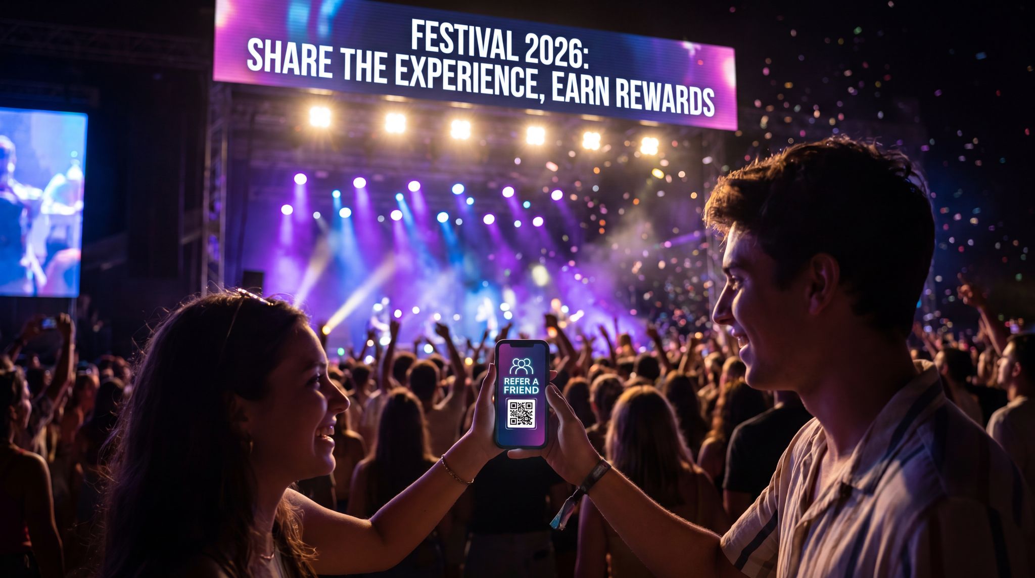
Grow Your Social Following With Every Sale
Require social media follows, shares, or playlist adds to unlock presale access or special pricing. Turn every ticket purchase into audience growth.
In practice, context matters for imagery. A gigantic outdoor festival might lean on epic wide-angle shots of the crowd and fireworks to emphasize scale, whereas an intimate club night could use a close-up of a dancer or DJ to convey the up-close excitement. Always ask: what single image will most excite my target audience? For niche events, featuring the community or activity can work (e.g. cosplayers at a fan convention). For broad events, a universally exciting element like happy attendees or a performer in action is effective. And don’t shy away from tapping into your lineup’s star power – featuring popular performers prominently can instantly catch the attention of their fanbase as they scroll, effectively using different images, text, or color variations. In short, pick one vivid image that encapsulates the appeal of your event, and let it take center stage in your ad creative.
High-Contrast Colors that Catch the Eye
Color is one of your best tools for standing out. In 2026, feeds are a blur of content, but strategic use of color can make your ads hard to miss. High-contrast combinations (like bright yellow text on a black background, or a luminous pink overlay on a dark image) naturally draw the human eye. Scrolling tests show that ads with bold color contrast often “pop” more compared to muted tones. Leverage this by incorporating your event’s brand colors in vivid ways – e.g. if your festival color is electric blue, use it for the headline text or border against a contrasting backdrop.
Ready to Sell Tickets?
Create professional event pages with built-in payment processing, marketing tools, and real-time analytics.
Also consider color psychology: certain hues evoke specific emotions, which you can tap into based on your event type. For example, red and orange convey energy, excitement, even urgency – perfect for a one-night-only concert or a ticket on-sale countdown (it’s no coincidence sale banners are often red). Blue evokes trust and calm – a common choice for business conference ads or events focused on networking and knowledge, based on fundamental principles of color psychology where individual responses to color associations play a role. Green suggests nature, wellness, or growth, ideal if you’re promoting an eco-themed festival or a yoga retreat. And purple implies creativity or luxury, which upscale arts events or VIP experiences might use. These aren’t strict rules, but aligning your color scheme to the mood you want people to feel can subtly increase resonance. For instance, a Halloween season event might use bold orange and black for seasonal relevance, whereas a summer beach concert could splash warm yellows and blues.
Crucially, make sure your color choices also serve visibility. Use contrast to ensure text overlays and key details are readable on all screens. Avoid placing light text on a light background or dark on dark – it will disappear in a quick scroll-by. Many designers apply a simple test: view your ad on a phone screen in grayscale – if the main elements still stand out in black-and-white, you’ve nailed the contrast. Additionally, lean into colors that differentiate your ad from the typical feed content. In 2026, a lot of social content uses white or soft pastel backgrounds; an ad with a vibrant neon gradient or a bold black background with bright text might break through that monotony and grab attention. Overall, color is your scroll-stopping ally – use it thoughtfully to both encapsulate your event’s vibe and ensure your creative can’t be ignored.
Minimal Text Overlay – Let Visuals Speak
When it comes to text on your visuals, the guiding principle is less is more. In a feed environment, people rarely stop to read long copy overlaying an image. If the visual itself is compelling, it will pull them in to read the caption or headline you provide separately. So focus on making the imagery do the storytelling, and keep on-image text to the essentials. As a rule of thumb in 2026, try to convey one clear message or offer in the visual with as few words as possible. This could be as simple as “Tickets On Sale Now” or “Dec 10 – NYC” in bold font, placed strategically so it’s instantly seen.
For many platforms, heavy text on images can also hurt performance. While Facebook no longer strictly enforces the old “20% text” rule, their algorithms (and user behavior) still tend to favor images that look organic and not like banner ads, preferring images that contain minimal text. An image plastered with text is a giveaway of an ad; it may be skipped due to “banner blindness.” Instead, integrate text subtly or not at all on the image if you can communicate the idea visually. For example, rather than writing “Music Festival” on the image, use a photo of a crowd in front of a festival stage – the visual conveys it. Use on-image text mainly for specifics that can’t be shown: event name, date, location, or a quick tagline/CTA. And make those text elements big, bold, and in an easy-to-read font. Think of someone flicking through their phone – they should decipher any words on your visual in a split second. Sans-serif, high-contrast fonts (white on dark, black on light, or neon on dark) are best for legibility at a glance.
Data-Driven Event Marketing
Track ticket sales, demographics, marketing ROI, and social reach in real time. Exportable reports give you the insights to make smarter decisions.
Ensure the design doesn’t look cluttered: plenty of “whitespace” (empty space) or background around text helps it stand out. If you have more to say, that’s what the post caption or event description is for – don’t try to cram it all into the graphic. A common pro tip is to design for mobile first – roughly 85%+ of social ad impressions occur on mobile devices in 2026. So, open your design on your phone: if the event name and date on your poster image aren’t instantly clear on a 6-inch screen, simplify or enlarge them. Overall, treat text as a supporting actor to the star (the imagery). The visual should hook the viewer emotionally, and the minimal text just reinforces the key details or next step.
Consistent Branding and Logo Placement
While you’re crafting bold, fresh visuals, remember to weave in your branding consistently. This not only builds brand recognition over time, but also lends professionalism and trust to your ads (critical for convincing people to buy tickets). Include your event or festival logo on most of your ad creatives – usually in a corner or along the top/bottom so it’s visible but not disruptive. By 2026, many event marketers use subtle logo watermarks or a consistent frame design on all their social graphics, so that even if someone sees multiple different ads, they instantly recognize “Oh, that’s the same event.” For example, a conference might always use its logo and a particular color border on every promotional image. A music festival might use a signature typography or icon. These consistent visual cues act like your creative DNA.
Grow Your Events
Leverage referral marketing, social sharing incentives, and audience insights to sell more tickets.
Be mindful of balance: branding elements should be present but not overpower the main message or imagery. A semi-transparent logo watermark in a corner, or a small logo next to the event date, can suffice. The last thing you want is for your beautiful ad visual to look like a generic banner with a giant sponsor-style logo. Authenticity and “native” feel are still important. So integrate branding in a design-savvy way. One effective technique is to use your brand color palette throughout the creative (for text, graphics, or filters), so even if the logo is small, the overall look feels on-brand. Over time, audiences recognize colors and styles associated with your event. For instance, Tomorrowland festival’s marketing is instantly identifiable by its unique font and fairy-tale graphic motifs; even before you spot the logo, you know it’s Tomorrowland because of the consistent visual branding.
Another modern tip: if you run multi-event series or recurring events, maintain a design family across them. A tour with 10 dates might have each poster featuring different local imagery, but a consistent layout and font family ties them together. Or if you host an annual expo, use the same logo placement and design template each year with updated visuals. This consistency not only reinforces your brand identity but also signals professionalism and reliability – key to winning consumer trust. In summary, aim for creative that is visually exciting and fresh, yet immediately attributable to your brand. The best event ads in 2026 scream “This is us – and you won’t want to miss it!” without needing to plaster the logo everywhere.
Crafting Scroll-Stopping Social Media Ad Images
Optimize for Each Platform and Format
Social platforms in 2026 offer a variety of ad placements – and one size does not fit all. To get the most out of your visuals, tailor them to each platform’s specs and user experience, ensuring you provide a professional graphic suitable for sharing. This means both technical dimensions and content style. For example, on Instagram and Facebook Feed, square or portrait (4:5) images perform well, whereas Stories and Reels require fullscreen vertical (9:16) formats. Twitter (now X) favors horizontal or 16:9 images that appear in-stream without cropping. If you’re running display ads or programmatic banners, you’ll need standard sizes like 300×250 or 728×90 that keep your key imagery clear even when scaled down, such as matching L339 display banners. Always use the highest resolution and correct aspect ratio for the platform so your ad looks crisp and professional.
Beyond dimensions, consider the content style per platform. Instagram is highly aesthetic – polished, visually cohesive content tends to thrive. This is a great place for your beautifully designed event flyers, artist photos with a consistent filter, or stylized graphics that match your event theme. On Facebook, which skews older, clarity and information matter: a strong image supplemented by visible event details (date, venue) can work well, as many users may share these posts for info. TikTok and Instagram Reels are all about authenticity and trendiness – even for image-based ads, you might convert them into short animated slideshows or use motion (like a subtle zoom) to fit the vibe. For X/Twitter, simplicity and boldness win: a single striking image or graphic with minimal text will catch eyes as users skim text-heavy timelines. On LinkedIn (if you promote B2B events), a crisp, professional graphic or speaker photo with clean typography is appropriate.
Recover Lost Ticket Sales
Automated abandoned cart emails re-engage potential buyers at the optimal time, recovering lost sales and boosting your conversion rate.
Here’s a quick reference on social platform creative differences in 2026:
| Platform | Primary Visual Formats | Creative Style That Works Best |
|---|---|---|
| Square & vertical images (1:1, 4:5); 15–60s Reels videos; Stories 9:16 | Visually rich & aspirational. Use high-quality photos with filters or branding aesthetics. Reels can be repurposed highlight clips. Consistent style and bold colors help your event stand out in feeds. Leverage Stories for FOMO (e.g. countdown stickers, polls). | |
| Horizontal or vertical images (feed); event page cover; 15s+ video ads | Clear, info-forward visuals. Older demographic means including key event details (date, venue) on image can boost engagement. Group shots and community vibes do well. Facebook Groups allow sharing your flyers directly. Ensure text is legible for desktop and mobile. | |
| TikTok | Full-screen vertical video (9:16 up to 60s); can use images in video format | Native, unpolished feel. Even image-centric ads should use motion or music on TikTok. Consider turning a static poster into a 5-second animated clip. Use trending colors/effects. Authentic fan-centric visuals or behind-the-scenes shots resonate with TikTok’s Gen Z audience. |
| X (Twitter) | Horizontal images (16:9 or 1200x675px) for optimal preview; short native videos or GIFs | Bold and simple. Use images with strong contrast or large text overlays for visibility in text feeds. Memorable graphics (a striking photo or a meme-style image) can grab attention. Great for sharing quick announcements or real-time event photos with a branded hashtag. |
| YouTube | Video ad formats (skippable 16:9 videos, or vertical Shorts under 60s); Thumbnail images | Compelling thumbnails and opening visuals are critical for video ads. Show the most exciting visual frame in the first 5 seconds (for skippable ads). For event trailers, keep them under 1 minute and highlight the best moments early. Vertical Shorts can be used for teasers. Ensure any text in thumbnails is large and clear. |
Each platform is a distinct stage for your visuals – adapt your artwork and messaging to play to each strength. This might seem like extra work, but repurposing content smartly can save time. For instance, you could design a core poster, then crop or rearrange elements for various dimensions. Tools in 2026 (like Canva or Adobe Express) make it easy to resize designs and shuffle elements so nothing important gets cut off. And always preview your creatives on the actual platform before finalizing – what looks good in a design tool might truncate on mobile. By respecting each platform’s norms and technical specs, your visuals will look native and appealing, rather than clunky or poorly cropped (which can hurt credibility).
When configuring a dedicated Facebook event ad, precision is critical. Promoters must ensure their assets align perfectly with the latest Facebook event image dimensions (typically 1920 x 1005 pixels, or a 1.91:1 ratio) to prevent awkward cropping across desktop and mobile feeds. A poorly cropped advertisement event graphic can obscure vital details like the venue or date, instantly diminishing trust and conversion rates.
Emphasize the Experience and Emotion
Remember, people buy experiences, not just tickets. Your ad images should convey what it will feel like to be at your event. Emotional storytelling through visuals is incredibly effective. Instead of just showing a performer on stage, include a cheering crowd to evoke the excitement of being there. If you’re promoting a food festival, a vibrant photo of friends laughing while trying food captures the joy and community much better than a plain dish photo. For a business seminar, an image of an engaged audience member asking a question or a speaker interacting warmly might resonate more than a generic stock photo of a microphone.
In 2026, audiences are drawn to content that feels authentic and relatable. Candid photos from previous events (if available) can be gold for this. Often, the best performing ad image is not the perfectly staged promo shot, but a genuine moment: a DJ high-fiving a fan over the decks, or attendees with their hands up in awe of a fireworks show. These kinds of visuals spark that “I want to be part of this” feeling. Even if you don’t have past event photos (e.g. it’s your first year), you can simulate the atmosphere – use high-quality stock images that align closely with the vibe you’ll create, or create an illustration that highlights unique elements (like a sketch of the venue with crowds). Some savvy promoters even do a brief photo shoot purely for marketing visuals – e.g. invite a few friends or actors to the venue in advance to capture “preview” shots of people enjoying the space, so you have authentic-looking content before the event happens.
Also think about storytelling in a single image. The classic event poster technique is to include multiple elements: artist images, venue, crowd, etc., but that can get busy. Instead, consider a single image that implies a story. For example, an aerial shot of a festival grounds at sunset with the crowd lit up tells a story of a day turning into a magical night. A before-and-after style graphic (two panels, perhaps) could show an empty venue vs. a packed house, implying the transformation your event brings. Use visual cues that spark imagination: a glowing stage seen through the silhouettes of an excited crowd, or a close-up of hands in the air, all suggest an unforgettable atmosphere. The more your image makes someone feel something – excitement, curiosity, belonging – the more likely they are to stop and engage.
Smart Promo Codes & Presale Access
Create percentage or flat-rate discount codes with usage limits, date ranges, and ticket type restrictions. Plus unlock codes for private presales.
Concert Visual Content Creation: Capturing Live Energy
When focusing specifically on concert visual content creation, promoters must translate the raw, visceral energy of live music into a static or short-form digital format. Unlike standard corporate event graphics, concert marketing assets need to highlight the audio-visual spectacle—think sweeping laser lights, the artist mid-performance, and the physical reaction of the crowd. To achieve this, many organizers hire dedicated touring photographers or specialized creative agencies who understand how to shoot in low-light, high-contrast stage environments. Building a robust library of these high-quality, music-centric assets allows your team to continuously pull fresh, dynamic imagery for social media ads, ensuring the promotional material feels as electrifying as the show itself.
Include a Subtle Call-to-Action Element
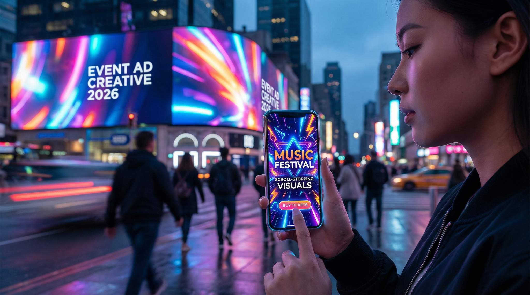
While the main goal of your ad image is to arrest attention and convey the event’s appeal, it’s also wise to subtly cue the viewer towards action. This can be as simple as overlaying a small “Get Tickets” button graphic or an arrow icon on the image, or incorporating language that hints “Book now” in a corner. On many platforms, the ad format will have a CTA button (like Facebook’s “Learn More” or “Buy Tickets”), so you don’t want to be redundant. But having a cue within the visual can reinforce what to do next, especially in organic posts or Stories where an external button might not exist. For example, an Instagram Story ad might include an animated “Swipe Up for Tickets ?” text (or in 2026, a “Link” sticker that you customize) – this appears as part of your creative, guiding users to take that action, similar to how you might keep display banners short and bold.
Even on static feed images, a small banner that says “Tickets Available Now” or “Early Bird Until May 1” can create urgency and clarity. Be careful not to let the CTA text clutter your design; it should look like a natural badge or footer. Many promoters use the bottom of the image for this – e.g. a colored bar along the bottom with the event date and a short CTA like “?? Tickets on Sale”. This doubles as info delivery and action prompt. The key is that if someone only glances at the image, they immediately glean what they can do (“tickets on sale”) and why (“don’t miss this amazing experience” from the imagery).
One modern best practice is designing click-worthy social thumbnails and preview images. For instance, when you drop a link on Facebook or Twitter, it often pulls a preview image – make that image count. Using a graphic that has a CTA arrow or enticing phrase like “? Secure Your Spot” as part of the thumbnail can improve click rates. Just ensure it still abides by platform guidelines (e.g. not too much text for Facebook’s preference, even if the rule is relaxed). On YouTube, if you’re running a video or even posting an event recap, design the custom thumbnail with a mini-CTA (“Watch Highlights”, etc.). These touches, while small, can bump engagement. They bridge the gap between capturing attention and driving action, which is ultimately what we need to sell tickets. As always, keep it concise and visually integrated – the image should first capture emotion, and the CTA element simply channels that excitement toward clicking the link.
Short-Form Video Snippets that Convert Viewers into Buyers
Hook Viewers in the First 3 Seconds
In 2026, video content reigns supreme for event marketing – but only if you grab attention immediately. The “3-second rule” is very real: you have about three seconds (often less) to convince someone scrolling through TikTok, Reels, or YouTube to watch the rest of your clip, as the attention crisis is real and measurable. Successful event promo videos start with a bang. For short-form videos (15–30 seconds), lead with the most jaw-dropping shot you have. This could be a quick cut of the headliner dropping their hit song, an aerial view of last year’s festival crowd roaring, or a dynamic montage of colorful lights and smiling faces. If it’s a conference, maybe it’s a bold statement on screen like “World’s Top Innovators on One Stage” or a 1-second flash of the keynote speaker addressing a packed hall. The idea is to create instant intrigue or excitement so the viewer thinks, “Whoa, what’s this?,” and stops scrolling.
One proven tactic is the use of pattern interrupts – something visually or audibly surprising right at the start. For example, begin with a sudden sound effect or the moment the beat drops in a music clip (since audio auto-plays on many platforms now). Visually, you could start with a quick sequence of 1-2 second highlights (crowd dancing, DJ on stage, confetti blast) to bombard the senses a bit, then settle into slightly longer shots after hooking them. On platforms like TikTok, you might even use a large text overlay in the first seconds with a teaser (“? Biggest festival of 2026? ?”) while the background flashes event highlights, focusing on bite-sized content for discoverability. That text can disappear after a moment, but it helps hook the viewer in those crucial early moments. Remember that on many apps, videos loop – so a common trick is designing your first 3 seconds to also seamlessly connect to the end, creating a loop that keeps people watching again (boosting your completion rates).
Free Tool: Am I Pacing to Sell Out?
Compare your current ticket sales to benchmark curves for events of your type and region. Free diagnostic with actionable recommendations — no signup required.
It’s not just about visuals either – text captions and thumbnails matter. On YouTube or Facebook, if you’re running longer video ads, ensure the default thumbnail image (or the very first frame) is compelling, because that’s what users see before they click play. A blurry stage or black screen won’t cut it. Choose a thumbnail with bright colors, an artist’s face, or big text that promises value (“Watch to see lineup reveal!”). And always consider adding captions or at least a text overlay of key points – in silent autoplay environments, a line of text like “Immersive Art, 5 Stages, 50+ DJs” appearing in the first second can hook a viewer even if sound is off, ensuring engagement remains a core tenet. By front-loading your videos with the best content and clear messaging, you dramatically increase the chances that people will watch longer and eventually take action, which prevents turning off viewers with disabilities.
Another effective technique for crafting scroll-stopping video content is the strategic use of motion to guide the viewer’s eye. For instance, applying a sudden zoom effect—similar to utilizing an Adobe Captivate zoom area or standard Ken Burns effects in your editing software—can force focus onto a specific detail, like a headliner’s name or a massive crowd reaction. This sudden shift in visual scale acts as a micro-pattern interrupt, keeping the brain engaged and preventing the user from swiping away.
Tell a Story in 15 Seconds
Short videos can pack a narrative punch if you structure them well. Rather than a random collection of clips, approach your 15-30 second promo video with a mini storytelling arc: a beginning (hook), a middle (build excitement or detail), and a big finish (payoff/CTA). For instance, start with that hook (as described above) to grab attention. Then, build by showcasing a few highlights that communicate the breadth of the experience – e.g. a quick sequence of “music, crowd, art, fireworks” for a festival, or “speaker on stage, networking, after-party fun” for a conference. This middle part is where you answer the viewer’s question: “What’s in it for me?” Show the variety or the headliners or the unique aspects that set your event apart.
Finally, finish with a strong call-to-action and brand cue – this is the payoff. Often it’s the event logo animated in with the dates and a “Tickets on Sale” message in bold. Many event marketers include a URL or swipe-up instruction here as well (e.g. “TicketFairy.com/YourEvent” briefly on screen or “Swipe up to book now” if it’s an ad). Even if the platform provides a link, putting the CTA in the video reinforces it. Make sure the final seconds are visually and emotionally satisfying, remembering that video marketing isn’t just about views. This could coincide with a music climax in the clip: as the song peaks, you show the event name and “Don’t Miss Out!” text with cheering crowd audio, leaving viewers pumped. If feasible, include a final shot that creates urgency – like a flashing “Limited Tickets” or a countdown to the event date, utilizing limited-time tactics like countdowns, encouraging immediate action. Just do so authentically; viewers are savvy and will tune out over-the-top gimmicks. But a genuine “Join us, last year sold out early!” message can work wonders at the end of a video.
Within that mini-story, aim to evoke emotion and FOMO. Use footage from past events if available: smiling faces, people hugging, that one epic moment everyone talked about – these lend credibility that “this actually is awesome.” If it’s a new event, consider simulated POV shots – e.g. a GoPro-style clip walking into the venue or onto the dancefloor, to put the viewer in the future attendee’s shoes (literally creating a sense of “this could be you”). Coupled with fast-paced editing (no shot on screen more than 2-3 seconds), you can convey a ton in a short span. The mantra is show, don’t tell: instead of a narrator saying “It will be fun,” just show the fun. Instead of listing features in text, show them happening. By the end of 15 seconds, the viewer should feel like they’ve glimpsed a whole experience – and ideally feel excited, informed, and prompted to get their ticket.
For larger-scale festivals, producing high-end event commercials for connected TV (CTV) or pre-roll placements requires a slightly different approach than raw social media snippets. These polished video assets should blend cinematic production values with a clear, urgent call-to-action, ensuring the creative event design translates seamlessly to a larger screen format.
Free Tool: When Should You Announce?
Pick your event date and genre — the free planner outputs a recommended announce, presale, on-sale and reminder schedule anchored to how your audience actually buys.
Design for Sound-Off (But Leverage Audio If On)
One of the quirks of modern video ads is that many people will watch them without sound, especially on mobile. On some platforms, up to 85% of video content is consumed with the volume muted by default. You must assume your video might be seen in silence and still make sense. That means including captions or text callouts for any important spoken information. If your video features a voiceover or an artist speaking (like “Can’t wait to see you at XYZ Festival!”), add subtitles so those on mute get the message, reinforcing engagement as a core tenet of accessibility. Even music-driven promos benefit from some text overlays reinforcing key details (event name, date, location, etc.), because the viewer might not hear the music that sets the tone.
Additionally, use visuals to imply sound when possible. Show the DJ dropping the bass and the crowd reacting to cue the viewer’s imagination of the sound. Show a speaker at a conference gesturing passionately to imply an engaging talk. Basically, ensure the video’s story doesn’t rely on audio alone. Many event promoters edit two versions of a clip: one with a punchy music track, and a parallel version with captions and maybe more on-screen text for silent autoplay scenarios. If you have to choose one, go with the captioned version with perhaps quieter audio, since that covers both bases. Also pay attention to pacing – a video with long shots of someone talking on stage with no captions will flop in silent mode. Whereas rapid, dynamic visuals transcend the need for sound.
That said, audio can be a huge asset when users do listen – especially for events centered on music or sound. So don’t neglect it. Pick a music track or sound effects that heighten the excitement. In 2026, using trending audio on platforms like TikTok can even boost your content’s reach via algorithm favor. For music festivals, showcasing a snippet of a headliner’s popular track in the video can trigger recognition (“Oh, I love that song!”) and make viewers more likely to buy a ticket to see it live. Just ensure you have the rights to use the music or use royalty-free analogs. Sound effects like crowd cheers, a quick air horn, or a suspenseful drumroll can add drama to a clip – and these still have an effect even if a viewer’s volume is low (they might catch a hint of it).
Ultimately, edit with a sound-off-first mindset, but sound-on enhanced. A good practice is to watch your final cut on mute – if it still tells the story and prompts action, you’ve done well. Then watch it with sound on – if the music/dialogue elevates it further without being necessary for comprehension, you’ve struck the right balance. This way, whether someone is scrolling in a quiet office with their phone muted or at home with headphones, your video promo will land effectively.
Capitalize on Trends and Native Styles
Each year brings new visual trends, especially driven by TikTok and Instagram. In 2026, smart event marketers ride these trends in their video content to boost relatability and shareability. Lean into native platform styles so your ads don’t immediately scream “ad” (which users often skip). For example, on TikTok a very polished cinema-quality video might be ignored if it feels out of place. Instead, you might format your content to feel like a user-generated snippet: incorporate a quick selfie cam intro from an artist (“Hey, see you at the festival!”), or mimic a popular meme format if it suits your event. Many promoters collaborate with TikTok creators to produce promo videos that have the pacing, humor, or editing tricks that are currently trending – essentially making the ad content itself entertaining in the way people expect on that platform, leveraging the authenticity advantage in a skeptical market.
Staying on top of trends is key. Is there a particular dance challenge or meme that’s hot? Perhaps your promo video can include a twist on it featuring your event. For instance, if a certain remix is all over Reels, use it under your footage for a built-in boost. If #FestivalThrowback is trending, maybe do a quick clip with nostalgic past event shots captioned “Can’t wait to be back – 30 days to go!”. Trends can also be visual effects: in past years, things like fast zoom cuts, retro VHS filters, or on-screen emoji explosions have had moments. Use platform editing tools or templates to sprinkle these in, showing that your content “speaks the language” of the platform. Just ensure any trend aligns with your brand – authenticity is crucial. A forced or outdated meme can do more harm than good, so choose trends that your target audience appreciates.
Testing different video creatives is also easier than ever with these short formats. You can make one version of a promo that’s very straightforward (text on screen + highlights reel) and another that’s goofy and meme-ish with an influencer cameo, and run both to see which resonates. Often the results can be surprising – a casual behind-the-scenes style clip might outperform a slick highlight reel. In fact, data shows that ads styled as user-generated content (UGC) often get higher engagement and better ROI because they feel more authentic. One analysis found UGC-style video ads earned 4× higher click-through rates and 50% lower cost-per-click than traditionally polished ads, because user-generated content builds trust, achieving the highest engagement rates on social media. So don’t hesitate to embrace a bit of lo-fi charm in your videos when appropriate. The end goal is to communicate your event’s story in a way that feels genuine and platform-native – and if you can piggyback on viral trends or formats, you’ll greatly increase your odds of stopping the scroll and converting viewers into ticket buyers.
Authentic & Inclusive Visuals: Building Trust with Your Audience
User-Generated Content Vibes for Authenticity
In 2026, audiences have finely tuned ad-filters – they swipe past anything that feels too salesy or staged. This is why embracing a user-generated content (UGC) style in your visuals can be a game-changer. Ads that look and feel like organic content often perform better because people’s “defenses” aren’t immediately triggered, as it looks like content someone follows. In practical terms, this might mean using footage shot on smartphones, incorporating real attendee photos, or mimicking the imperfect, candid style of content actual users post. For example, instead of a glossy promo photo of your headliner, you might use a fan’s Instagram photo from a past show (with permission) that shows the artist on stage from the crowd’s view. Or create an ad that’s literally a stitched-together set of Instagram Story clips from previous attendees – grainy phone videos, excited selfies, genuine laughter – it will exude authenticity, since it doesn’t look like an ad.
Why go this route? Trust and relatability. According to industry research, a whopping 92% of consumers trust peer recommendations over brand ads, proving that authenticity is king in 2026. So when your event visuals look like they’re coming from fellow fans, they inherently carry more credibility. People think, “others like me enjoyed this, so maybe I will too.” Even if it’s technically an ad you produced, if it captures that realness, it bridges the gap. One strategy is to actually solicit content from your community: run a contest for the best fan photo or video from last year’s event, and feature the winners in your marketing (with credit). Not only do you get authentic visuals, but you also make those fans feel like part of the story – a win-win.
Keep in mind, authentic doesn’t mean sloppy. You still want to ensure a certain quality and clarity. It’s more about the tone. For instance, you might stage a short video to look candid: have someone pretend to film their friend at your venue saying “We’re here at X event and it’s wild!” – it’s planned, but appears off-the-cuff. Also, diversify your representation in these authentic visuals. Show real attendees of various backgrounds (age, gender, ethnicity) enjoying the event, to highlight that everyone’s welcome. People notice inclusivity; seeing someone “like them” in the visuals can increase their connection to the event, and as accessibility opens new attendee segments, it builds community. The goal is to make your marketing feel less like an ad and more like a sneak peek into an amazing communal experience, ensuring all digital content is accessible. By borrowing the look and feel of UGC, you tap into the authenticity advantage – as one expert puts it, modern audiences “scroll past glossy ads, but they stop for genuine moments shared by real people”, highlighting the authenticity advantage. Use that insight to your benefit.
Diverse Imagery and Inclusive Design
Who you feature in your visuals is as important as what you feature. To resonate with the widest audience (and simply to be a good human), ensure your event creative embraces diversity and inclusivity. This means using imagery that reflects a mix of ages, cultures, body types, and abilities whenever possible. If all your ads only show one kind of person (e.g. young, model-esque individuals), many potential attendees might subconsciously feel “this event might not be for me.” On the other hand, when people see themselves represented, it sends a powerful message: you belong here. As noted in inclusive marketing research, representation in ads leads to higher engagement because viewers feel invited, and not only do 15% of the population have disabilities, but accessibility welcomes new attendee segments.
For example, if you’re promoting a music festival that truly is for everyone, show a range of attendees: different ethnicities, maybe a clip of someone with a disability enjoying the show, older attendees dancing alongside the young. These genuine touches not only expand your appeal but also build goodwill and trust in your brand. It signals that you’re thoughtful and welcoming. Of course, do this authentically – choose images from real moments or stock that doesn’t look tokenistic (avoid stereotypes or forced diversity shots). It should feel like a natural mosaic of your community. Also ensure the imagery of performers or speakers in your creative is diverse if the lineup allows; it can attract their respective fanbases and underscore inclusivity on stage and off.
Apart from who is depicted, consider inclusive design elements. This includes using high-contrast colors and readable fonts so that people with visual impairments or color blindness can still engage with your content, ensuring engagement remains a core tenet. Adding alt text to images on web pages and social posts (where supported) ensures screen reader users know what’s shown. If you include any text, avoid jargon or slang that could alienate non-native speakers or certain groups (unless it’s specifically targeted for a segment). For example, using simple language like “Accessible venue” vs. a wheelchair icon alone can clearly communicate to all. If you have multiple languages in your audience, consider creating versions of key graphics in those languages or at least ensuring that the visuals are culturally neutral enough to be understood universally (colors, symbols can have different meanings in different cultures). The trend in 2026 is that accessible content is good content – it not only reaches more people, it demonstrates professionalism and care, reinforcing engagement as a core tenet of marketing. Many accessibility features overlap with good design: e.g. captions on videos help not only the deaf/hard-of-hearing but also the majority of users who watch with sound off, as mentioned earlier.
By making diversity and inclusion a cornerstone of your visual strategy, you widen your pool of potential attendees and build a positive brand image. People notice when an event consistently uses diverse models/attendees in their ads – it positions your event as a welcoming space for all. And from a pure ROI perspective, tapping into underrepresented audiences can be a blue ocean; competitors may ignore them in marketing, so your inclusive approach can capture loyal new fanbases. In sum: showcase the beautiful diversity of your community and make sure your creative is accessible to everyone – it’s both the right thing and the smart thing to do in 2026.
Leverage Influencers and Artist Content (Authentically)
Another way to infuse authenticity is to leverage content from artists, speakers, or micro-influencers involved with your event. An artist’s personal style content often resonates more than polished ads from the promoter. For example, have your headliner do a quick selfie video invite – “Hey Chicago, I’m hyped to play at XYZ Fest next month, come party with me!” – and then use that in your social ads (with their permission). Fans of that artist will see it as genuine communication rather than an ad, and it lends star power to your promotion. Similarly, if a local influencer attends your event or does a venue tour, their vlog-style clips can be gold for marketing. People trust creators they follow, so incorporating that style of content boosts credibility, since fans ignite demand and fill venues, placing community and fans at the forefront. Just keep it feeling real and unscripted. Overly scripted influencer promos can backfire; it should seem like they’re sharing their genuine excitement.
Co-creation is key. You might supply the facts (date, lineup) but let the influencer or artist present it in their own voice. Maybe a comedian MC in your lineup makes a funny skit about prepping for the event – that’s engaging content you can cross-post or promote. Or a popular photographer on Instagram might share their favorite shot from last year’s event with a personal anecdote – go ahead and reshare that as part of your campaign. These human perspectives add depth to your visuals. They also inherently create a social proof effect: if respected figures are talking about and attending your event, it validates the experience’s value and helps create emotional investment, showing potential buyers that this event is unmissable. We’ve seen big festivals run official ad campaigns that are essentially compilations of influencer reactions and fan TikToks from previous editions – essentially turning attendee content into the marketing. It works because it’s both FOMO-inducing and credible.
When using this approach, maintain transparency and permission. Tag or credit the content creators and follow platform rules (like marking something as an ad if an influencer is involved in paid promotion). But often you can get great material just by offering the creator value: early access, a free ticket, or just the exposure of being featured by you (for smaller creators). Many emerging artists will happily record a shout-out video for your event because it also boosts their engagement – a two-way win. By weaving these authentic voices and footage into your visuals, you not only diversify your content but also humanize your event brand. The event stops being just a logo and becomes a community of real people – artists, fans, creators – all excited about this upcoming experience. That’s the kind of marketing that doesn’t feel like marketing, and it’s incredibly effective in converting skeptics into attendees.
Designing Event Posters & Flyers that Demand Attention
Strong Visual Hierarchy for Information
Event posters and flyers are a more traditional form of visual promotion, but they’re still hugely relevant in 2026 – both in print and as digital shareables. The key to a great poster is organizing information so it’s digestible at a glance. This means establishing a clear visual hierarchy: what’s the first thing you want someone to see? Likely the event name or headliner. Make that the largest text. The next most important could be the date and location – that can be slightly smaller, but still bold. Supporting details (lineup, tagline, ticket URL, sponsors) come after in the hierarchy. Use size, color, and position to guide the eye through the poster in a logical flow.
For example, a classic layout might have the Festival Name in huge stylized font at the top, the date/location in a contrasting color right below, then a big image or art in the middle, and the lineup and ticket info at the bottom. Someone walking past it should immediately catch “Festival X – July 2026 – London” within one second of looking. If those hook them, they’ll come closer or spend more time to read the rest (like the lineup fine print or the QR code for tickets). Think about how your poster will usually be seen: maybe on a wall, from a few feet away, or as a small thumbnail image in a social feed. Design so that critical info pops even at a distance or small size.
Use font weights and styles intentionally. Headlines (event name, headliners) in a big, distinctive font; supporting info in a clean, readable font. A common mistake is letting the design get too “fancy” at the expense of clarity – like using a very artistic but illegible font for the event name. It might look cool up close, but if people can’t immediately recognize the text, it’s a missed opportunity. Instead, incorporate artistic flair in graphics or accents, but keep text mostly straightforward for readability. Bullet points or icons can help condense info (e.g. use ? icon to label the lineup section, ? icon next to the date). Highlight any major draws: if admission is free or if there’s a famous headliner, those can be in a bright color or uppercase for emphasis. The bottom line is to prioritize information: people expect a poster to tell them what, when, where, and why to care, in that order. A well-structured design ensures they get all that in a few seconds of scanning.
Eye-Catching Layout and Artwork
While clarity is king for info, a poster still needs to be artistically compelling to lure people in the first place. Layout is how you arrange all elements (text, images, logos) on the canvas, and great layouts use balance and creativity to stand out. In 2026, many event posters have moved beyond the old-school “band list on a black background” look to more imaginative compositions. Consider using layering and depth: overlay text partially on top of images, or have graphic elements (like geometric shapes, paint splashes, or 3D renders) interact with your text. For instance, the event name could appear to be behind a silhouette of the city skyline if your design features the city. This creates visual interest and a premium feel.
Colorful, illustrated posters are also very popular for festivals and niche events. Commissioning custom artwork or using generative AI to create unique poster art is a trend, showing what generative AI brings to the table, as generative AI tools reduce the time it takes to brief designers. If you have an artistically distinctive poster, people are more likely to share it on social media or even keep it as a souvenir. Think of Coachella’s iconic lineup poster style or the psychedelic art of EDM festival flyers – they become part of the brand. So, define a style that matches your event’s personality: maybe it’s futuristic neon art for a rave, hand-drawn doodles for an indie craft fair, or sleek minimalism for a tech conference. Ensure your layout accommodates that style but doesn’t sacrifice readability (which ties back to hierarchy). Often the artwork is the background or central image, and text is laid out around it.
Don’t shy away from white space (empty space) either – sometimes a cleaner design with lots of breathing room can be more striking than one crammed edge-to-edge. A sparse poster with just a bold title, one image, and lots of blank background can radiate confidence and modernity, if it suits your vibe. On the flip side, a controlled maximalism can work too – e.g. a collage of photos of all performers arranged creatively can grab eyeballs as people try to spot details. Just avoid any look that seems generic. Study other posters in your city; then aim to differentiate. If every other event is using dark grungy flyers, your bright, colorful one will pop out on the wall (and vice versa). An effective trick is designing the poster to be highly recognizable even from afar – maybe it’s an unusual color scheme or a big shape (like a giant circular logo) that catches the eye from across the street.
Finally, consider print-friendly vs. digital-friendly. If you’ll be physically printing, use CMYK colors and high dpi so it looks crisp. For digital sharing, optimize file size and maybe add a subtle animation (some events create animated poster graphics for social media where the background might sparkle or text fades in). A table summarizing your poster design checklist can help:
| Poster Design Element | Best Practices & Tips |
|---|---|
| Headline Text (Event Name) | Largest size; unique font but highly legible; placed at top or center for immediate visibility. Use a color that contrasts with background. |
| Date & Location | Prominent and near the top; could be just below the title. Use icons (?, ?) for quick recognition. Ensure it’s readable from a distance (e.g. bold font). |
| Lineup/Details | Use columns or centered text for lineups. For long lists (festivals), vary text size by artist importance (headliners larger). Don’t overcrowd – if too many names, consider a separate schedule flyer or QR code to website. |
| Imagery/Artwork | High-resolution; reflects event theme. Position main image to allow space for text (e.g. people in bottom, sky at top for text overlay). Integrated illustrations can surround text. |
| Branding & Logos | Include event logo and any key partner logos. Keep them smaller than main info. Place at bottom or top corners. Maintain aspect ratio (no stretched logos). |
| Call-to-Action | If space, add a short CTA: “Tickets at TicketFairy.com” or a QR code for tickets. Place at bottom in a box or highlight color. Make it easy to find but not dominating the design. |
| Colors & Contrast | Use brand/event colors, but ensure text vs background contrast is strong for readability. Test print a small version to see if colors look good in real life lighting. |
| Spacing | Don’t cram text to edges; leave margins. Group related info (date & time, or venue & address together) so the layout feels organized. |
Using these principles, you create posters and flyers that are not only visually appealing but also effective communication tools. Whether someone spots it on a cafe bulletin board or shares the digital flyer in a WhatsApp group, the design should instantly tell them what’s happening and excite them about it. A well-designed poster can become iconic – people might stick it on their wall as art (free advertising!). At minimum, it should make them stop, read, and think “I want to be there.”
Balancing Creativity with Clarity
Event promoters often have to walk the line between wild creative vision and practical clarity, especially on posters that carry lots of info. It’s crucial to balance the two. You want a design that’s fresh and artistic enough to catch attention (and reflect the event’s personality), but if you go too far into creative abstraction, people might miss what the event actually is. For example, a poster that’s just an image of an astronaut DJ (cool concept) but buries the event name in tiny text at the bottom looks awesome – but might leave viewers confused about what it’s advertising. Conversely, a plain text-heavy poster communicates details but doesn’t excite. So aim for that sweet spot.
One approach is to use creativity in service of clarity. If you have a creative theme or artwork, incorporate textual elements into it. Perhaps the astronaut’s helmet visor is the text area where the event name is displayed in a funky font – now your art and info are fused. Or if your event has a theme (like 1920s speakeasy party), use the thematic fonts and motifs (Art Deco borders etc.), but ensure all modern key info is there (date, address, etc., even if that breaks theme a bit). It can help to get a fresh set of eyes on your design: have someone not involved in the event look at the poster for 5 seconds and tell you what they got from it. If they can’t quickly pick out the what/when/where, you may need to dial back the artsiness in those areas.
Also, be mindful of information overload. It’s tempting to put every sponsor logo, every performer name, and every bit of hype text (“Live art! Fireworks! Food trucks!”) on the poster. But too many elements can make a design incoherent. It’s often better to direct viewers to a website or QR code for full details, rather than stuffing everything in. A clean poster might just say “ABC Festival – June 1, Central Park – Get Tickets for full lineup & schedule” rather than listing 50 artists and set times. You can produce separate schedule flyers or web pages for the nitty-gritty. The main poster’s job is to hook interest and convey the essential identity of the event.
Keep printing in mind too – if your design is too dark or too fine-detailed, it might not print well on flyers or look good from far away on a billboard. High-contrast and bold elements work better for physical media as they don’t blur. Many veteran marketers will print a test copy at actual size to ensure readability and look, catching issues that a screen might hide. Nothing worse than printing 500 posters and realizing the red text is illegible in daylight against a certain background color.
In summary, strive for an engaging yet clear poster design. Marry form and function: let the creative elements reinforce the message, not obscure it. When you strike the right balance, your poster will not only be pretty to look at but also an incredibly potent tool for driving awareness and excitement. People will get the info they need and feel the vibe you want to convey, all in one glance – and that’s the hallmark of a masterful event poster.
Extending the Visual Experience: Creative Ticket Design
While posters and digital ads get fans to the checkout page, the visual journey shouldn’t end there. Creative ticket design is an often-overlooked touchpoint that can drive additional organic reach. Whether you are issuing digital passes for Apple Wallet or mailing out physical VIP wristbands and commemorative holographs, treating the ticket as a piece of art encourages attendees to share their purchase on social media. A beautifully crafted digital ticket asset acts as a secondary promotional tool; when fans screenshot and post their “I’m going!” updates, a striking design ensures that organic share is just as scroll-stopping as your paid campaigns.
Furthermore, integrating your core campaign artwork into the actual event ticket design creates a cohesive brand loop. Whether fans are holding a physical poster event ticket hybrid or saving a stylized digital pass to their mobile wallet, that asset serves as a lingering reminder of the upcoming experience. Thoughtful ticket aesthetics elevate the perceived value of the purchase, turning a simple barcode into a collectible piece of memorabilia.
Testing and Optimizing Your Ad Creative for Maximum Impact
A/B Test Different Visuals and Formats
Even the most seasoned designers can’t predict with certainty which creative will perform best – that’s where A/B testing comes in. By 2026, testing ad creative variants is standard practice for data-driven event marketers facing budget constraints on the wrong tactics, rather than relying on gut feelings. The idea is simple: run two (or more) versions of an ad that are identical except for one element, and see which drives better results. For example, you might test image A vs image B for the same event ad, or a static image vs a video, or even different color schemes on otherwise identical banners. Pay attention to metrics like click-through rate (CTR), conversion rate (tickets sold per impression), and engagement (likes/shares/comments) to judge the winner. It’s quite common to find that one image outperforms another by a significant margin – in one case, a festival found that an image focusing on the crowd and lasers had a 30% higher CTR than an image focusing on the DJ alone. You wouldn’t know that without testing.
When testing, only change one variable at a time in each test so you can pinpoint the cause and confidently credit a performance boost. For example, Version A and B use the same photo and text, but A’s background color is blue and B’s is red – now you’re testing color impact. Or A and B have the same design but different headliner photos – testing which artist has more pull in ads. If you changed both color and photo between A and B, you wouldn’t know which change made the difference. Use platform tools (Facebook Ads Manager, etc.) which often have built-in A/B test functions, or run them manually by splitting your audience randomly. Let the test run long enough to gather meaningful data, ensuring you run tests long enough for significance, which means reaching statistically significant results. Don’t jump to conclusions after 20 clicks; patterns can change with more data.
Some particularly useful creative tests for event marketing:
– Headline focus vs. experience focus: e.g. an ad where the visual is the main headliner vs. an ad where it’s a crowd scene or venue. Which draws more interest? (If the headliner has a strong fan base, probably theirs will; if the overall vibe is the seller, the crowd shot might win), where testing different creatives reveals user behavior.
– Image vs. short video: as mentioned, videos often yield higher engagement, but not always more conversions. Test a high-energy 15s video against a stunning static poster. It could be the video gets more likes but the poster gets more ticket clicks due to clarity, so you should A/B test a compelling image against video and compare metrics like engagement. Let the data decide.
– Various CTAs: Try “Buy Tickets” vs “Learn More” vs “RSVP Now” text on your ad or button. Believe it or not, sometimes a softer CTA like “Learn More” can get more people to click, but those might be lower intent; “Buy Tickets” might get fewer but more serious clickers. Track through to actual purchases to see which yields a better cost per acquisition, to see if it raises concerns or drives purchases, noting that ‘Buy Tickets’ might attract serious buyers.
– Format tests: Carousel ad (multiple images) vs single image. A carousel showing several artists or festival attractions could boost engagement, or it might distract and a single image does better at driving action, where you can experiment with carousels versus single images. Only one way to know: test it! Since many social platforms optimize format.
By systematically testing creative elements, you take the guesswork out of design decisions. Marketers have sometimes been surprised – a flyer they internally preferred lost out to a simpler design in terms of results. According to one analysis, short-form video ads can produce dramatically higher CTR, as video content has proven effective, showing that short, clear info drives immediate action. The best practice is to start your campaign with multiple creative concepts (why not launch with 3-4 variations if budget allows?), then quickly funnel budget towards the top performer once data rolls in. Continually refreshing and testing new ideas throughout a campaign can also combat ad fatigue, by featuring a second popular artist to see if banners are driving clicks. Seasoned event marketers often plan “creative rotations” – e.g. swap in a new image or tweak design every 2-3 weeks and test again, which helps rotate creatives to keep engagement high.
Monitor Metrics and Iterate
Once your ads are live, keep a close eye on the metrics that matter. Click-through rate (CTR) tells you how enticing your creative+headline combo is; conversion rate (on the ticket page) tells you how well those clicks turn into sales. If CTR is low, often the creative isn’t resonating or doesn’t stand out enough. If CTR is high but conversions are low, maybe the creative misled people (they clicked out of curiosity but weren’t sold, meaning maybe the ad wasn’t showing the right expectations). Use these insights to iterate.
For example, if you see one ad image has a 1.5% CTR and another only 0.5% with similar targeting, you have a clear winner – retire the low performer and try to make more variants similar to the winner (perhaps featuring the same artist or color scheme). Or if your video ad has tons of views but not many ticket sales, check the video watch analytics: do many people drop off at a certain point? It could be your key info or CTA comes too late. Next iteration, you might show the “Tickets available now” earlier in the video or in the text overlay. Maybe you’ll discover through metrics that your Reels ads get lots of engagement but your feed story images drive more website clicks – that could inform shifting more budget into Reels for awareness but using static feed ads for conversion targeting.
Also watch engagement metrics like shares and comments. If people tag friends or comment “let’s go!”, that’s a sign your creative is generating interest (and giving you organic reach via shares). You might notice certain imagery generates excited comments (“That stage looks insane!” on a stage photo ad) – lean into that in future creatives. Conversely, if you get feedback like “this ad is too hard to read” or questions about basic info, those are red flags to clarify your design.
Don’t forget the power of post-event analysis as well. After the event, review which ad creatives or posts actually contributed the most to ticket sales. With proper tracking (UTM links, conversion pixels, etc.), you might find that one particular graphic on Twitter surprisingly drove a chunk of sales, or that the video ad performed best in generating awareness but most final conversions came from retargeting ads with simpler visuals, proving that beyond creative and copy analysis is vital. Use those learnings for your next event. Maybe the futuristic theme graphics you tried flopped, but the ones featuring real people worked – that guides your style moving forward, allowing you to save budget on the wrong tactics.
A culture of continuous improvement is key. In practice, that means setting aside a small slice of budget and time during the campaign to test new creatives (even mid-campaign) and to refine the current ones. Some promoters will do things like A/B test the event page hero image or the header on the ticketing site as well, to see what converts people who arrive there, because the battle isn’t over after the click, as you must turn visitors into confirmed attendees. The work doesn’t stop once the ads are live – that’s when the real optimization fun begins. By treating your creative like a living, testable component, you ensure that you’re always squeezing the most tickets out of every impression. And importantly, you’ll cater best to your audience’s preferences because you’re literally responding to their behavior data.
Refresh Creatives to Combat Fatigue
Even the best ad creative has a shelf life. With the speed of social media, ad fatigue can set in quickly – meaning the same audience seeing the same visual over and over will start ignoring it, or worse, find it annoying. In event campaigns, which often run for weeks or months leading up to the show, it’s crucial to periodically refresh your visuals to keep things fresh. A good rule of thumb is to have a new creative ready whenever you notice engagement dropping or frequency getting high (e.g. the average person in your target has seen the ad 5+ times). But even preemptively, swapping out creatives every 2-3 weeks can prevent fatigue from ever occurring, by featuring a second popular artist, which prevents ads from getting stale.
Refreshing doesn’t always mean a complete overhaul. It could be changing the background image but keeping the text and layout, or vice versa. For example, mid-campaign you might update the poster image in your ads to feature a “50% Sold Out” banner on it – it’s both a fresh visual and introduces urgency. If you led initially with one headliner’s image, later swap in another headliner or a group shot. This not only re-engages people who saw the first one already, but might catch new interest from those who are fans of the second artist. If your early creative was very general, consider making later creatives more specific (e.g. highlight different attractions: one ad focuses on “Afterparty with Special Guest DJ” while another highlights “Gourmet Food Village at the Festival”). Rotating these gives people different reasons to get excited.
Consider the timing of your refreshes with campaign phases. Early on, you might use broad hype imagery. As you shift into last-minute sales, refresh to urgency-themed creatives (like a ticking clock graphic, text like “Last Chance,” etc.). After a major announcement (like new lineup additions or a venue upgrade), definitely reflect that in updated creative. A common pitfall is failing to update ads when something changes – if your original flyer didn’t have the newly added special guest, update it in the ads to avoid missing that selling point.
Also, expand creative formats in refreshes. Maybe you started only with static images – try layering in some motion graphic videos later, or a carousel. If you haven’t tried a selfie video from the organizer or artist, mid-campaign is a great time to introduce that as a new angle. It’s not just to fight fatigue, but also to capture any segment that wasn’t sold on the original creative. Sometimes a person might ignore five photo ads but click immediately on a video once they see music and motion. By diversifying creatives over time, you maximize the campaign’s reach and effectiveness.
One thing to watch: when refreshing or doing new creatives, treat it like another test. Don’t turn off your best old creative immediately if it’s still doing okay – add the new one and let them both run to compare. If the audience is partially new or hadn’t maxed out frequency, the old one might still have legs. Transition gradually, unless the old one truly tanked. And always carry forward learnings – if bright colors worked better than dark initially, likely your refreshes should keep that insight (no need to reinvent the wheel each time). In essence, plan a creative calendar alongside your media calendar. This ensures your visuals evolve with your campaign, keeping people intrigued and pressing that “Buy Tickets” button rather than yawning at the same old ad.
Embrace Tools and Automation (Without Losing the Human Touch)
Finally, it’s worth noting that 2026 offers lots of advanced tools to aid in creative optimization. AI-driven design assistants and dynamic creative optimization platforms can automatically generate variations of your ads and serve the best-performing ones. For example, you can feed a platform several images, headlines, and text options, and it will mix-and-match and learn which combinations yield the highest ROI, similar to finding the reasons EDM Fest 2026 will sell out, based on the inputs you give to find the winner. This can uncover winning creatives you might not have predicted. Programmatic ads even allow swapping elements based on the viewer profile (like showing a different background image to a rock fan vs. an EDM fan in the same campaign), allowing you to swap out the background image, though this doesn’t remove the need for human oversight. These technologies can save time and maximize efficiency – it’s like multivariate testing on steroids.
Event marketers must pay attention to the dynamic competitive environment because audience preferences and platform algorithms shift almost daily. This is exactly why dynamic creative optimization platforms (DCOs) have become indispensable for large-scale festival producers. These systems don’t just test A against B; they automatically assemble thousands of ad permutations in real-time, matching specific visual elements—like a particular stage design or artist photo—to the exact user profile most likely to convert. By leveraging a DCO, promoters can maintain a relentless pace of creative testing, ensuring their campaigns remain highly relevant and visually arresting even as competitor ads flood the feed.
Additionally, generative AI tools can help you quickly brainstorm new visuals – you could generate dozens of background art concepts with a tool like Midjourney or DALL·E to find fresh inspiration, seeing what generative AI brings to the table. Some event marketers use AI to create multiple poster art variations and test which style the audience responds to. AI can also upscale images, remove backgrounds, or even dynamically create short video slideshows from static assets, all of which can be handy for rapid creative refreshes, as generative AI tools reduce briefing time. Templates and automation in social ad managers let you produce format-specific versions in a snap (resizing, reformatting text) – no need to manually craft each one from scratch.
However, don’t lose the human touch. These tools are powerful, but they work best with human guidance. An algorithm might find that a certain weird image gets clicks, but you need to sanity-check if it aligns with your brand and will convert to actual ticket buyers (clickbait vs. quality clicks). AI might produce some cool art, but someone with marketing savvy should decide if that art truly conveys the event’s feel or might confuse people. And dynamic systems optimize for the metric you feed – if you only tell it to optimize for clicks, it might learn a flashy graphic gets clicks, even if those people don’t buy. You would want to ensure it optimizes to the purchase event if that’s possible, or manually study the quality of traffic from each creative.
Use automation to handle the grunt work and find patterns, then apply your expertise to interpret and refine. For instance, if the machine finds 5 top-performing combos, you as the marketer can look at them and deduce “aha, all these have the artist close-up – that’s a theme” and then intentionally design more variations in that vein or use that insight in other channels like email banners or website design. Also, maintain brand consistency; automated creatives can sometimes come out looking off-brand if left unchecked. Set some rules or review them regularly.
When done right, combining human creativity and oversight with AI and automation’s speed and data crunching can take your ad creative game to the next level. Some festivals reportedly expanded their creative output 5x by using AI assistance, enabling constant fresh content without 5x the staff, proving that leveraging AI for creative work offers tangible benefits, whether for schedule releases or stage lineups. Just remember that analytics and instincts go hand in hand. Numbers tell you what people did, but understanding why they did it (and predicting what they might like next) is still an invaluable human skill. Keep your marketing team’s experience and gut feelings in the loop, empowered by the data rather than replaced by it. This balanced approach ensures your creative stays both effective and genuine – ultimately translating to more tickets sold and more fans thrilled to attend your event.
Frequently Asked Questions About Event Ad Creative
What makes an event ad truly scroll-stopping?
A scroll-stopping ad relies on high-contrast visuals, immediate pattern interrupts (like sudden motion or audio drops), and a clear, singular focal point. For event promoters, this usually means leading with your most striking asset—whether that’s a massive crowd shot, a vibrant stage production, or a highly recognizable headliner—within the first 1.5 seconds of a user seeing the post.
How do dynamic creative optimization platforms benefit festival organizers?
Dynamic creative optimization platforms allow festival organizers to automatically test and assemble thousands of ad variations in real-time. By dynamically swapping out background images, artist photos, and call-to-action text based on the viewer’s demographic and behavioral data, these tools ensure the most relevant and engaging visual is always served, maximizing return on ad spend.
What are the best practices for concert visual content creation?
Effective concert visual content creation requires capturing the authentic energy of live performances. Best practices include hiring specialized live music photographers who excel in low-light environments, focusing on the relationship between the artist and the crowd, and utilizing dynamic video snippets that showcase stage production. The goal is to produce assets that evoke FOMO and translate the live audio-visual experience into scroll-stopping promotional material for your campaigns.
What are the ideal Facebook event image dimensions for a promotional ad?
For a standard Facebook event ad, the recommended image dimensions are 1920 x 1005 pixels (a 1.91:1 aspect ratio). Adhering to these exact specifications ensures your advertisement event graphics display cleanly across both desktop and mobile news feeds without cropping out essential text or branding.